
Bahar & Bloom — Permanent Jewelry Booking Page
A walk-in appointment and a twenty-guest bridal shower are not the same booking. This is how one page on a Toronto studio’s Shopify store handles both — and teaches a nervous first-timer what permanent jewelry is on the way to the button.
Client: Bahar & Bloom, Toronto · Platform: Shopify, Atelier theme · Vasrue’s role: creative direction and web development · Live: baharbloom.ca/pages/permanent-jewelry
The problem she brought
Bahar & Bloom is a mobile permanent-jewelry studio: a fitted chain welded closed at the wrist, ankle, or finger, at the customer’s venue — weddings, bridal and baby showers, corporate events, private pop-ups. The Shopify store already existed and already sold product. What it did not have was a page that could sell the experience, and take a booking for it.
Her posting asked for four things: a step-by-step guide to how permanent jewelry works, scheduling for both individual appointments and group or event reservations, a dedicated enquiry section for private parties, pop-ups, and corporate hosts, and editable assets she could maintain herself.
The design problem underneath the posting was this: an individual appointment and an event are not the same booking. A single walk-in slot is self-serve — pick a time, done. A twenty-guest bridal shower is a quote first: headcount, venue, date, duration. Push both through one booking widget and either the events break or the walk-in customer gets buried in qualifying questions. And before either of them will book, a first-timer has to be talked past “what even is this? does it hurt? can I take it off?”
What was asked for
- A how-it-works guide, step by step
- Booking for individuals and for events
- An enquiry section for hosts and corporate buyers
- A page she could keep editing without a developer
What actually had to be solved
- Two different bookings that cannot share one booking widget
- Education that does the selling before anyone commits
- A brand feel that survives a phone screen
- Nothing invented: her prices, her policies, her words
The approach: two paths on one page
Vasrue proposed two paths on a single page, with the education doing the selling before anyone is asked to commit. An individual takes the short road — the hero’s second button drops them at the enquiry form with “individual or small group” already selected. A host takes the long road through packages and pricing, and every “Plan Your Wedding” or “Request this package” button lands on the same form, where the event type is the first field she asks for. Both of them pass the five-step guide and the FAQ on the way down.
Creative direction
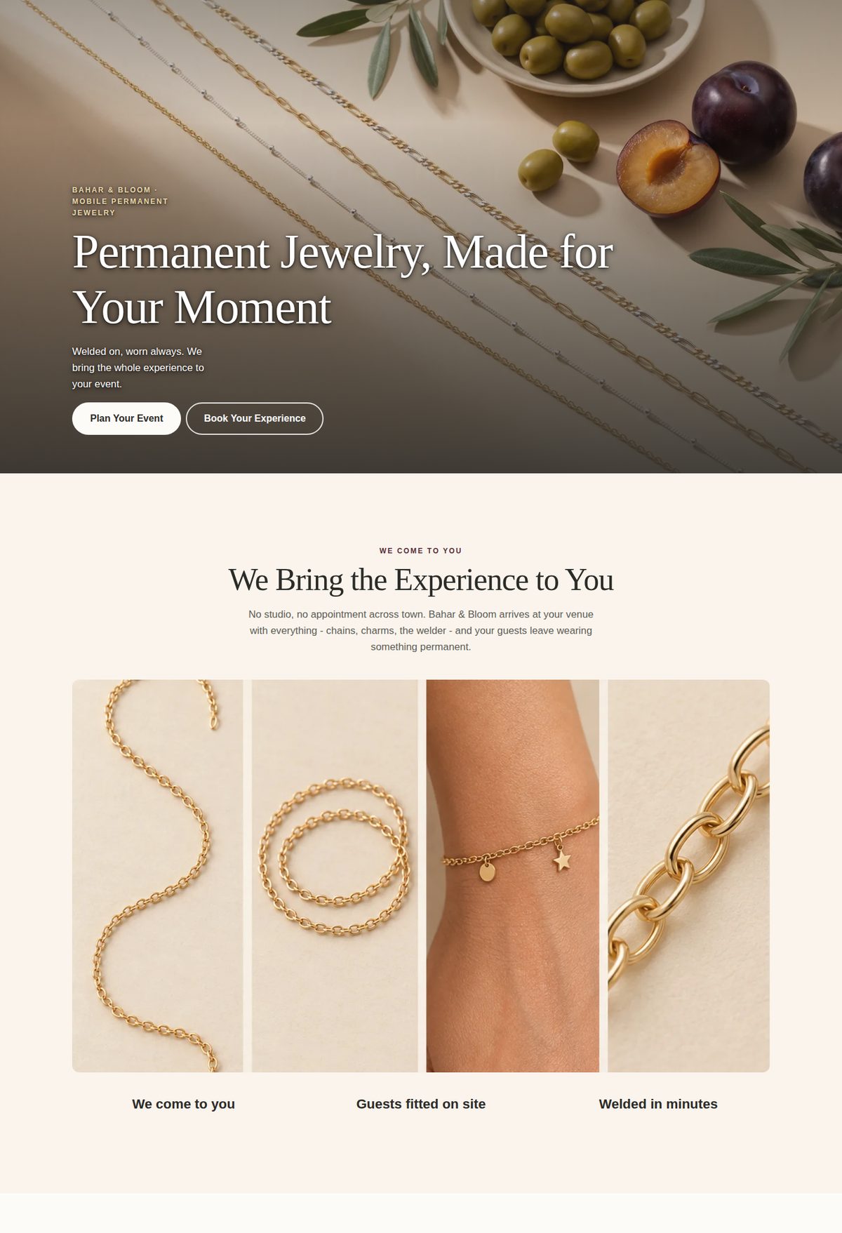
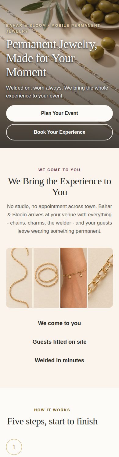
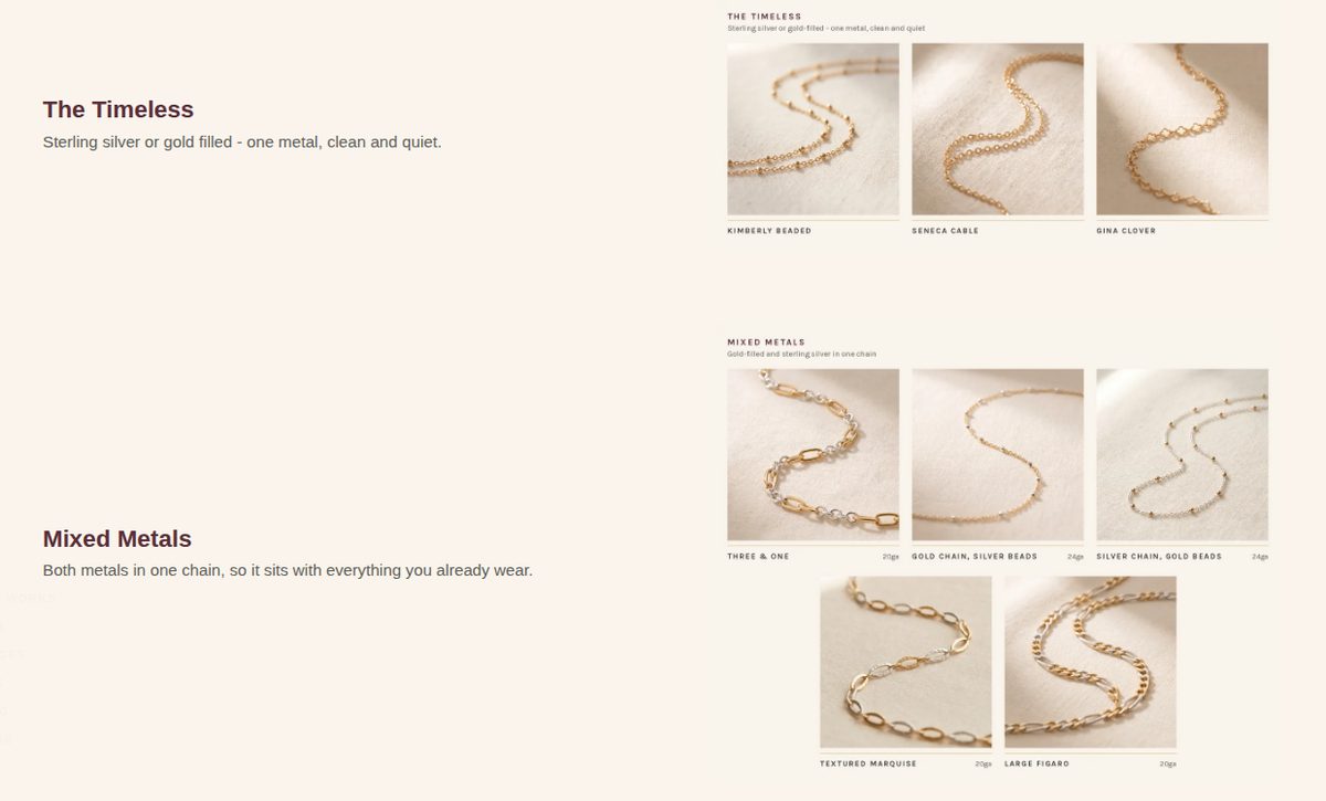
The page had to feel like her brand — warm, botanical, quiet luxury — and had to work on a phone first, because that is where a bride-to-be is standing when she finds it. The direction was built as a proper mockup phase before any Shopify work: three complete concept pages with identical copy and identical sections, so the client was choosing a feel rather than proofreading three drafts. The shipped direction pairs Cormorant Garamond display type over Karla body text, a sage / beige / gold palette lifted from her existing site, and a photo system in which every chain is shot the same way, on the same linen, so the page reads as one studio rather than a collage.
Information architecture
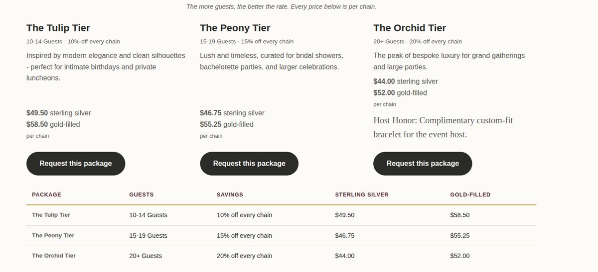
Eleven sections in the order a nervous first-timer needs them: hero → “we come to you” → how it works in five steps (her words, verbatim) → event types → event packages with tiered per-chain pricing → chains & charms → transparent pricing → the event enquiry form → what happens next → FAQ → re-welding policy and aftercare. A left-hand timeline rail on desktop and a “Jump to” pill on mobile — her ask — so nobody scrolls blind.
Build
A custom Shopify section with a full schema, so every heading, price, tier, FAQ answer, image, and policy line is editable by her in the theme customizer — no developer needed to change a price. Scoped CSS so nothing leaks into the rest of her store. A native Shopify contact form for event enquiries that lands in her inbox with headcount, venue, date, and chain preferences already captured, with a required deposit acknowledgement so the terms are agreed before the conversation starts.
Working with the client
Three phases, as promised in the proposal: discovery, mockups, then revisions until she said it was finished. Two things from the revision rounds are worth showing, because they are what a real client relationship looks like.
She sent marked-up phone screenshots — arrows and cross-outs — asking for the title font to come back to the serif, step numbers and titles to sit above their photos instead of below, chain-collection headings above their images, duplicate text lists removed where the photo already carried the names, and a redundant “every chain we carry” strip cut. Vasrue repeated her list back to her in plain English before touching anything, got a “yes, go,” built it on an unpublished copy of the live theme, verified it as an anonymous visitor rather than trusting an admin preview, and published within the day.
“I like this a lot better. Clean and to the point. Easy to navigate.”
— Bahar & Bloom, after reviewing the revised preview
The result
A live, mobile-first booking and education page on her own Shopify store, entirely editable by her, with a working event-enquiry pipeline and a clear self-serve path for individuals — delivered in the promised window, revised to her mark-ups, and approved in writing.
A paid client engagement. Shown with the client’s written permission. The portfolio copy linked below is a static snapshot of the delivered page: its enquiry form is display-only, and prices and policies are shown as they were at delivery. The live page is the source of truth for current offers. No bookings or conversion figures are claimed; none have been measured.
Creative direction, Shopify section development (Liquid, schema), landing page design, mobile-first layout, information architecture, form and enquiry flow, design-direction mockups, client revision management.
Have a service that needs explaining before it can be booked?
Send the project details and Vasrue will review the request.